Code
library(tidyverse)
library(showtext)
library(ggtext)

# Load a custom font from Google Fonts
font_add_google("Libre Franklin", "franklin")
showtext_opts(dpi = 300)
showtext_auto()all about interesting chart
Welcome to the Chart Club! In this document, we will explore a variety of interesting and informative chart types, all created using the R programming language and the powerful ggplot2 package. We will delve into the code and concepts behind each chart, providing a practical guide to creating your own stunning visualizations.
This first chart visualizes the change in the weekly US death rate since the beginning of the COVID-19 pandemic. It provides a stark visual representation of the pandemic’s impact on mortality.
We start by loading the necessary packages: tidyverse for data manipulation and plotting, showtext for using custom fonts, and ggtext for advanced text rendering.
library(tidyverse)
library(showtext)
library(ggtext)
# Load a custom font from Google Fonts
font_add_google("Libre Franklin", "franklin")
showtext_opts(dpi = 300)
showtext_auto()The data for this chart is sourced from the Centers for Disease Control and Prevention (CDC).
# Load pre-pandemic data
pre0 <- read_csv("./data/Weekly_Counts_of_Deaths_by_Jurisdiction_and_Age_20250615.csv",
         col_types = cols(`Week Ending Date` = col_date(format = "%m/%d/%Y")))

pre <- pre0 %>%
  filter(Jurisdiction == "United States" & Type == "Unweighted") %>%
  summarize(pre_deaths = sum(`Number of Deaths`), .by = `Week Ending Date`) %>%
  rename(date = `Week Ending Date`)

# Load post-pandemic data
post0 <- read_csv("./data/Provisional_COVID-19_Death_Counts_by_Week_Ending_Date_and_State_20250615.csv",
         col_types = cols(`End Date` = col_date(format = "%m/%d/%Y")))

post <- post0 %>%
  filter(State == "United States" & Group == "By Week") %>%
  select(date = `End Date`, post_deaths = `Total Deaths`) %>%
  group_by(date) %>%
summarise(post_deaths = sum(post_deaths))We combine the pre- and post-pandemic data into a single data frame and create a new variable to distinguish between the two periods.
deaths_by_week <- full_join(pre, post, by = "date") %>%
  mutate(deaths = if_else(is.na(post_deaths), pre_deaths, post_deaths)) %>%
  select(date, deaths) %>%
  mutate(pre_post = if_else(date < "2020-03-01", "pre", "post")) %>%
  filter(date >= "2015-03-01" & date <= "2025-05-17")

pre_deaths <- deaths_by_week %>%
  filter(pre_post == "pre") %>%
  summarize(mean = mean(deaths)) %>%
pull(mean)We use ggplot2 to create a line chart showing the weekly deaths over time. We use geom_rect to highlight the post-pandemic period and geom_hline to show the average pre-pandemic death rate.
gg <- deaths_by_week %>%
  ggplot(aes(x = date, y = deaths, color = pre_post)) +
  geom_rect(xmin = ymd("2020-03-01"), xmax = ymd("2026-03-01"),
            ymin = 0, ymax = 1e6, fill = "#FCF0E9", color = "white") +
  geom_hline(yintercept = c(60000, 80000, pre_deaths),
             linewidth = c(0.2, 0.2, 0.4),
             color = c("gray80", "gray80", "black"),
             linetype = c(1, 1, 2)) +
  geom_line(show.legend = FALSE,
            linewidth = 0.75) +
  annotate(geom = "text", hjust = 0, vjust = -0.2,
           family = "franklin", size = 8.5, size.unit = "pt",
           x = ymd("2015-03-01"),
           y = c(60000, 80000),
           label = c("60,000", "80,000 deaths per week")) +
  annotate(geom = "text", family = "franklin",
           x = ymd("2022-09-01"),
           y = pre_deaths * 0.98,
           label = "2015-19 average") +
  coord_cartesian(expand = FALSE, clip = "off") +
  scale_y_continuous(breaks = c(60000, 80000),
                     limits = c(45000, 89000)) +
  scale_x_date(breaks = ymd(c("2016-01-01", "2018-01-01", "2020-03-01",
                              "2022-01-01", "2024-01-01")),
               labels = c("2016", "2018", "March 2020", "2022", "2024")) +
  scale_color_manual(breaks = c("pre", "post"),
                     values = c("#58595B", "#F05A27")) +
  labs(x = NULL,
       y = NULL,
       title = "Total U.S. deaths") +
  theme(
    text = element_text(family = "franklin"),
    plot.background = element_rect(fill = "#EEEEEE"),
    plot.title = element_textbox_simple(face = "bold", size = 11.5,
                                        fill = "white", width = NULL,
                                        padding = margin(5, 4, 5, 4),
                                        hjust = 0),
    plot.margin = margin(4, 15, 10, 10),
    axis.text.y = element_blank(),
    axis.ticks.y = element_blank(),
    axis.text.x = element_text(size = 8.5, margin = margin(t = 3),
                               color = "black"),
    axis.ticks.length.x = unit(4, "pt"),
    axis.ticks.x = element_line(linewidth = 0.4),
    panel.grid.minor = element_blank(),
    panel.grid.major = element_blank(),
    panel.background = element_rect(fill = NA)
  )
gg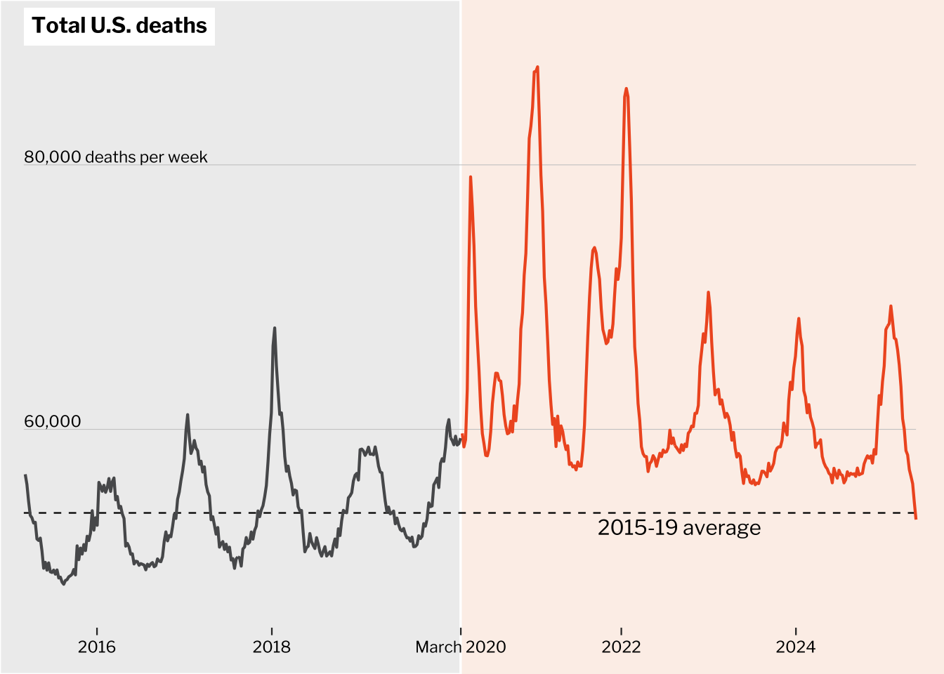
We can save the chart as a PNG file using ggsave() and also display it as an interactive plotly chart using ggplotly().
ggsave("pre_post_covid.png", width = 6, height = 4.26)

library(plotly)
ggplotly(gg)This chart visualizes the volatility of the S&P 500 index, highlighting weekly losses.
We load quantmod for retrieving financial data.
library(quantmod)We use the getSymbols() function from quantmod to retrieve the historical data for the S&P 500 index (^GSPC).
beginning <- as.Date("2025-01-01")
ending <- Sys.Date()

sandp <- getSymbols("^GSPC", auto.assign = FALSE) %>%
  as_tibble(rownames = "date") %>%
  select(date, close = GSPC.Close) %>%
  mutate(date = parse_date(date),
         week = isoweek(date),
         year = year(date)) %>%
  filter((date >= beginning - 7 & date <= ending) &
           ((year == 2024 & week == 52) | year == 2025)) %>%
  nest(weekly = -c(week, year)) %>%
  mutate(
    weekly_close = map_dbl(weekly,
                           ~slice_max(.x, order_by = date) %>% pull(close)),
    prev_weekly_close = lag(weekly_close),
    weekly_loss = weekly_close < prev_weekly_close) %>%
  drop_na(prev_weekly_close) %>%
  unnest(weekly)

rectangles <- sandp %>%
  summarize(first = min(date),
            last = max(date),
            weekly_loss = unique(weekly_loss), .by = c(week, year)) %>%
select(first, last, weekly_loss)We create a line chart of the S&P 500 closing price and use geom_rect to highlight the weeks with losses.
month_label <- sandp %>%
  filter(day(date) <= 7) %>%
  distinct(month = month(date, label = TRUE), year, date) %>%
  group_by(month, year) %>%
  filter(date == min(date)) %>%
  ungroup()

gap <- 0.005
ymax <- (1 + gap) * max(sandp$close)
ymin <- (1 - gap) * min(sandp$close)
month_y <- ymin * 0.97

gg <- sandp %>%
  ggplot(aes(x = date, y = close, group = week)) +
  geom_rect(data = rectangles,
            aes(xmin = first, xmax = last,
                ymin = ymin, ymax = ymax, fill = weekly_loss),
            inherit.aes = FALSE) +
  geom_hline(yintercept = seq(5100, 6100, 200),
             color = "gray80", linewidth = 0.2) +
  geom_line(color = "#016C90", linewidth = 0.75) +
  geom_point(color = "#016C90") +
  geom_text(data = month_label,
            aes(x = date, y = month_y, label = paste0(month, " ", year - 2000)), inherit.aes = FALSE,
            family = "franklin", size = 9, size.unit = "pt") +
  labs(
    title = "Investors recoil from Trump's pledge to remake the\nglobal economy.",
    subtitle = "<span style = 'color:#F6904C'>**Orange bars**</span> indicate weekly losses from end of previous week.",
    caption = "Source: Yahoo"
  ) +
  scale_fill_manual(
    breaks = c(TRUE, FALSE),
    values = c("#FDE3D4", "#E9F0F3")
  ) +
  coord_cartesian(expand = FALSE, clip = "off",
                  ylim = c(ymin, ymax)) +
  scale_y_continuous(breaks = seq(5100, 6100, 200),
                     labels = scales::label_number(big.mark = ",")) +
  scale_x_date(limits = c(min(sandp$date) - 2, max(sandp$date) + 2),
               breaks = seq(as.Date("2025-01-06"), max(sandp$date), 14),
               date_labels = "%e") +
  theme(
    text = element_text(family = "franklin"),
    panel.grid = element_blank(),
    panel.background = element_blank(),
    legend.position = "none",
    plot.title.position = "plot",
    plot.title = element_text(family = "domine", size = 16, face = "bold",
                              lineheight = 1.2),
    plot.subtitle = element_markdown(family = "domine", size = 10,
                                     color = "gray30",
                                     margin = margin(t = 23, b = 19)),
    plot.caption.position = "plot",
    plot.caption = element_text(hjust = 0, size = 8, color = "gray30",
                                margin = margin(t = 29)),
    plot.margin = margin(t = 8, r = 10, b = 8, l = 7),
    axis.title = element_blank(),
    axis.ticks = element_blank(),
    axis.text.x = element_text(margin = margin(t = 3))
  )
gg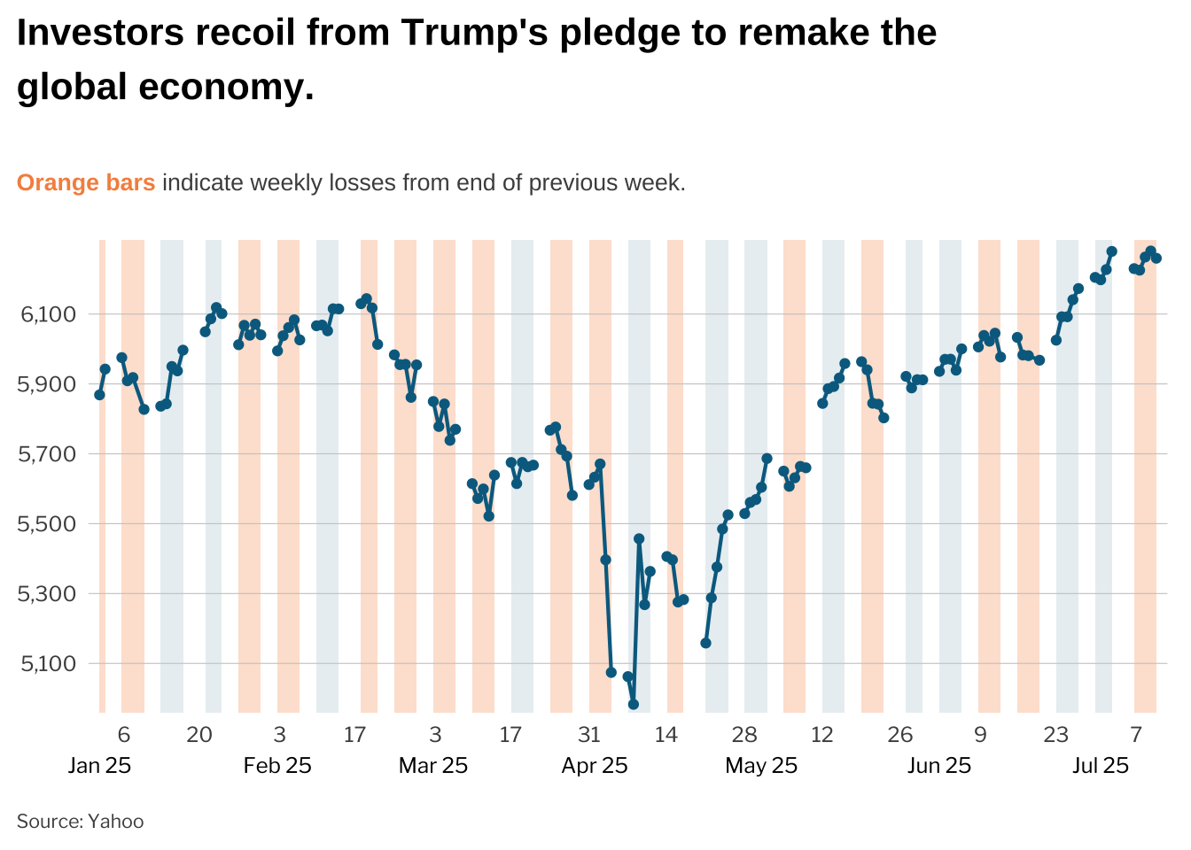
ggsave("sandp500_weekly.png", width = 6, height = 5.17)A waffle chart is a great way to visualize parts of a whole. In this example, we use a waffle chart to assess proposals for cutting the US budget.
We use the tabulapdf package to extract tables from a PDF document.
library(tabulapdf)The data for this chart is sourced from a PDF document from the Center on Budget and Policy Priorities.
# Function to create the waffle data
waffler <- function(d, n_rows = 7){
  n_cols <- ceiling(sum(d$billions) / n_rows)
  n_na <- n_cols * n_rows - sum(d$billions)

  d <- uncount(d, billions) %>%
    arrange(budget)

  if(n_na != 0) {
    d <- bind_rows(d, tibble(budget = rep(NA, n_na)))
  }

  bind_cols(d, expand_grid(col = 1:n_cols, row = 1:n_rows))
}

scale_factor <- 5 # $billions
nrows <- 5

# Extract table from PDF
out <- extract_tables('./data/60870-By-the-Numbers.pdf')
pdf_data <- out[[1]] |> janitor::clean_names()

pdf_data002 <- pdf_data[-c(1, 2), ]
pdf_data003 <- pdf_data002 |> separate_wider_delim(cols = x6, delim = " ", names = c("left", "right"), too_few = "debug")
pdf_data004 <- pdf_data003 |>
  select(name = the_budget_outlook_by_fiscal_year, right) |>
  filter(name %in% c("Social Security", "Medicare", 'Medicaid, CHIP, and marketplace subsidies', 'Defense', 'Nondefense', 'Other mandatory')) |>
  mutate(
    new_name = case_when(
      name == "Social Security" ~ "social_security",
      name == "Medicare" ~ "medicare",
      name == "Medicaid, CHIP, and marketplace subsidies" ~ "medicaid",
      name == "Defense" ~ "defense",
      name == "Nondefense" ~ "nondefense",
      name == "Other mandatory" ~ "other_benefits"
    ),
    order = case_when(
      name == "Nondefense" ~ 1,
      name == "Defense" ~ 2,
      name == "Medicaid, CHIP, and marketplace subsidies" ~ 3,
      name == "Medicare" ~ 5,
      name == "Social Security"  ~ 6
    )
  ) |>
  arrange(order) |>
  select(category = new_name, billions = right)

budget0 <- tribble(
  ~percent_cut, ~pretty,
  16, "**Nondefense discretionary funding**<br><span style='color:gray40;font-size:8pt;'>Federal programs, contracts, grants and employment</span>",
  16, "**Defense**",
  16, "**Medicaid, Obamacare, CHIP**<br><span style='color:gray40;font-size:8pt;'>CHIP is Children's Health Insurance Program</span>",
  16, "**Other benefits to individuals**<br><span style='color:gray40;font-size:8pt;'>Anti-poverty programs, farm aid, military retirement, other \"mandatory\" spending</span>",
  16, "**Medicare**",
  16, "**Social Security**"
)

budget <- cbind(pdf_data004, budget0) |>
  mutate(billions = billions |> str_remove_all(",") |> as.numeric(),
         bill_cut = billions * percent_cut / 100,
         bill_remain = billions - bill_cut,
         category = factor(category, levels = category)
)We use geom_tile to create the waffle chart, with each tile representing $5 billion in spending.
data <- budget %>%
  select(category, cut = bill_cut, remain = bill_remain) %>%
  pivot_longer(-category, values_to = "billions", names_to = "budget") %>%
  mutate(billions = round(billions / scale_factor, digits = 0),
         budget = factor(budget, levels = c("remain", "cut"))) %>%
  nest(data = -category) %>%
  mutate(waffle = map(data, waffler, n_row = nrows)) %>%
  select(category, waffle) %>%
  unnest(waffle)

pretty_labels <- pull(budget, pretty)
names(pretty_labels) <- pull(budget, category)

pretty_cut <- budget %>%
  mutate(y = nrows,
         x = ceiling(max(billions) / scale_factor / nrows),
         label = paste0(percent_cut, "% cut")) %>%
  select(category, x, y, label)

gg <- data %>%
  ggplot(aes(x = col, y = row, fill = budget)) +
  geom_tile(color = "white", linewidth = 0.3, show.legend = FALSE) +
  geom_point(data = tibble(category = factor("social_security"),
                           col = 1, row = -2,
                           budget = "remain"),
             shape = "square", color = "#9E9E9E", size = 2,
             show.legend = FALSE) +
  geom_text(data = tibble(category = factor("social_security"),
                          col = 2, row = -2,
                          budget = "remain"),
            label = "Each box represents $5 billion in projected fiscal year 2026 spending. Defense and nondefense\ndiscretionary amounts represent budget authority.",
            color = "#9E9E9E", family = "franklin", size = 8, size.unit = "pt",
            hjust = 0, vjust = 0.8, lineheight = 1, show.legend = FALSE) +
  geom_text(data = pretty_cut,
            aes(x = x, y = y, label = label),
            hjust = 0.95, vjust = -0.8,
            family = "franklin", fontface = "bold",
            size = 10, size.unit = "pt", color = "#FC1F76",
            inherit.aes = FALSE) +
  facet_wrap(vars(category), ncol = 1,
             labeller = labeller(category = pretty_labels)) +
  labs(
    title = "How to reach $1 trillion <span style='color:#FC1F76;'>if Social Security and Medicare are added as equal cuts:</span>",
    caption = "Source: Analysis of Congressional Budget Office data by Richard Kogan, Center on Budget and Policy Priorities • Note: Interest payments on the federal debt are not shown. • The New York Times"
  ) +
  scale_fill_manual(
    breaks = c("remain", "cut"),
    values = c("#9E9E9E", "#FFADC9"), na.value = "#FFFFFF"
  ) +
  coord_cartesian(expand = FALSE, clip = "off") +
  theme(
    text = element_text(family = "franklin"),
    panel.grid = element_blank(),
    panel.background = element_blank(),
    axis.title = element_blank(),
    axis.text = element_blank(),
    axis.ticks = element_blank(),
    plot.title = element_textbox_simple(face = "bold", size = 14,
                                        margin = margin(b = 10)),
    plot.caption = element_textbox_simple(color = "gray40", size = 8.5,
                                          lineheight = 1.3,
                                          margin = margin(t = 20, b = 5)),
    strip.text = element_markdown(hjust = 0, size = 10, lineheight = 1,
                                  margin = margin(0, 0, 2, 0)),
    strip.background = element_blank(),
    panel.spacing.y = unit(-10, "pt")
  )
gg
ggsave("budget_waffle.png", width = 6, height = 6.4)library(tidyverse)
library(showtext)
library(ggtext)
library(glue)
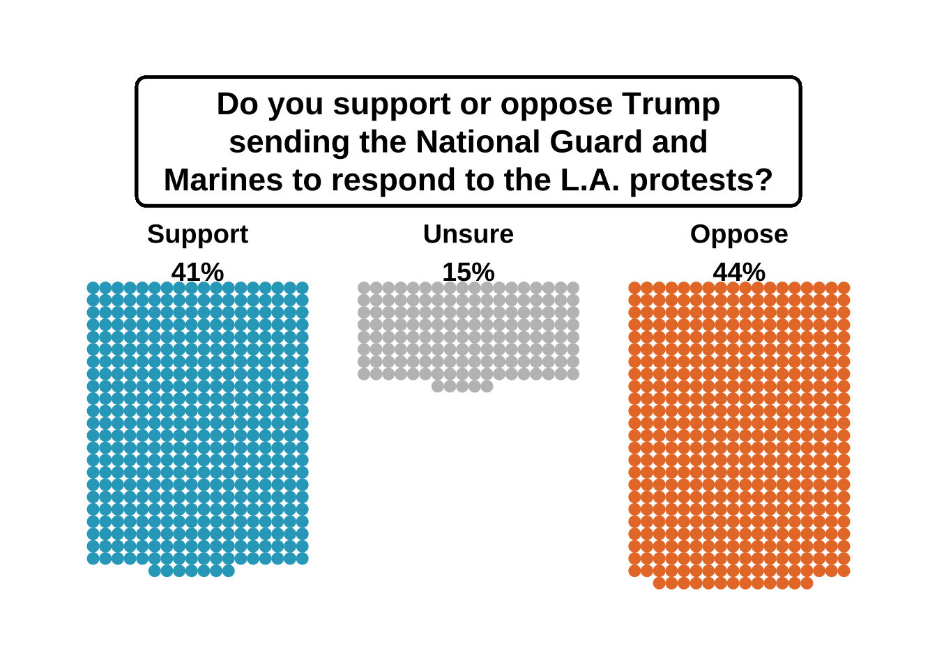
library(ggimage)# Data
data <- tribble(
~category, ~count, ~color,
"Support", 421, "#2ca7c4",
"Unsure", 149, "#bfbfbf",
"Oppose", 445, "#e87b34"
) %>%
mutate(percentage = paste0(round(count / sum(count) * 100), "%"))
cols_per_group <- 18
group_spacing <- 22
# Dot layout with centered bottom row
dot_data <- data %>%
uncount(weights = count) %>%
group_by(category) %>%
mutate(dot_id = row_number() - 1,
row = dot_id %/% cols_per_group) %>%
group_by(category, row) %>%
mutate(
dots_in_row = n(),
start_col = floor((cols_per_group - dots_in_row) / 2),
col = start_col + row_number() - 1
) %>%
ungroup()
spacing_factor <- 2.1
dot_data <- dot_data %>%
mutate(
group_index = match(category, unique(data$category)) - 1,
x = (col + group_index * group_spacing) * spacing_factor,
y = (-row - 6) * spacing_factor
)
# Find max y per group (top dot in each group)
label_y_positions <- dot_data %>%
group_by(category) %>%
summarize(max_y = max(y)) %>%
arrange(match(category, data$category)) %>%
pull(max_y)
# Put label slightly above top dot (adjust +3 or so)
label_y_positions <- label_y_positions + 6
# X positions for labels (centered like before)
label_x_positions <- c(8.5, 8.5 + group_spacing, 8.5 + group_spacing * 2) * spacing_factor
title_text <- "Do you support or oppose Trump\nsending the National Guard and\nMarines to respond to the L.A. protests?"
title_x <- mean(range(dot_data$x))
title_y <- max(dot_data$y) + 25# Plot
ggplot(dot_data, aes(x = x, y = y)) +
geom_point(aes(color = category), size = 2.5) +
scale_color_manual(values = setNames(data$color, data$category)) +
coord_equal(clip = "off") +
theme_void() +
theme(
legend.position = "none",
plot.margin = margin(40, 30, 10, 30)
) +
geom_label(aes(x = title_x, y = title_y, label = title_text),
size = 6,
label.size = 0.8,
fill = "white",
color = "black",
label.r = unit(0.25, "lines"),
label.padding = unit(c(0.4, 0.7, 0.4, 0.7), "lines"),
fontface = "bold",
lineheight = 1.0) +
annotate("text", x = label_x_positions[1], y = label_y_positions[1],
label = paste0(data$category[1], "\n", data$percentage[1]), size = 5, fontface = "bold", hjust = 0.5) +
annotate("text", x = label_x_positions[2], y = label_y_positions[2],
label = paste0(data$category[2], "\n", data$percentage[2]), size = 5, fontface = "bold", hjust = 0.5) +
annotate("text", x = label_x_positions[3], y = label_y_positions[3],
label = paste0(data$category[3], "\n", data$percentage[3]), size = 5, fontface = "bold", hjust = 0.5)