Code
import plotnine
print(plotnine.__version__)0.14.5![]()
Plotnine is a Python implementation of the Grammar of Graphics, inspired by R’s ggplot2. It allows you to create complex and beautiful plots by adding layers of data, aesthetics, and geoms. This document provides a guide to creating various plots with Plotnine.
import plotnine
print(plotnine.__version__)0.14.5from plotnine import *
import seaborn as sns
import pandas as pd
# Load an example dataset
tips = sns.load_dataset("tips")
tips.head()| total_bill | tip | sex | smoker | day | time | size | |
|---|---|---|---|---|---|---|---|
| 0 | 16.99 | 1.01 | Female | No | Sun | Dinner | 2 |
| 1 | 10.34 | 1.66 | Male | No | Sun | Dinner | 3 |
| 2 | 21.01 | 3.50 | Male | No | Sun | Dinner | 3 |
| 3 | 23.68 | 3.31 | Male | No | Sun | Dinner | 2 |
| 4 | 24.59 | 3.61 | Female | No | Sun | Dinner | 4 |
A scatter plot is used to visualize the relationship between two continuous variables.
p = (
    ggplot(data=tips) + aes(x="tip", y="total_bill") + geom_point()
)
p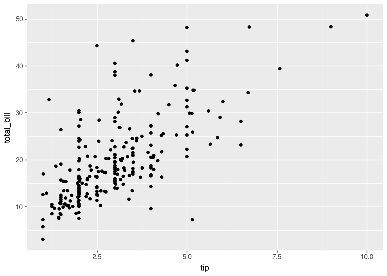
You can color the points based on a categorical variable to see how the relationship varies across different groups.
p = (
    ggplot(data=tips) + aes(x="tip", y="total_bill") + geom_point(aes(color="sex"))
)
p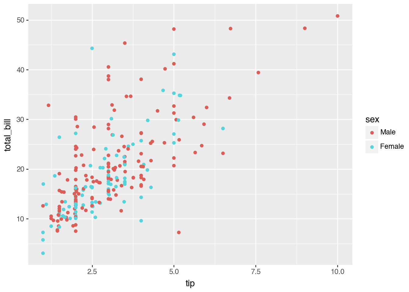
The size of the points can be mapped to a variable to add another dimension to the plot.
p = (
    ggplot(data=tips) + aes(x="tip", y="total_bill", size="size") + geom_point()
)
p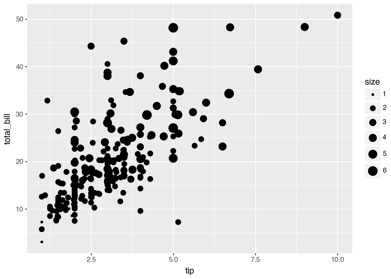
A line plot is suitable for showing the trend of a variable over time.
dowjones = sns.load_dataset("dowjones")
dowjones.head()| Date | Price | |
|---|---|---|
| 0 | 1914-12-01 | 55.00 |
| 1 | 1915-01-01 | 56.55 |
| 2 | 1915-02-01 | 56.00 |
| 3 | 1915-03-01 | 58.30 |
| 4 | 1915-04-01 | 66.45 |
p = (
    ggplot(data=dowjones) + aes(x="Date", y="Price") + geom_line()
)
p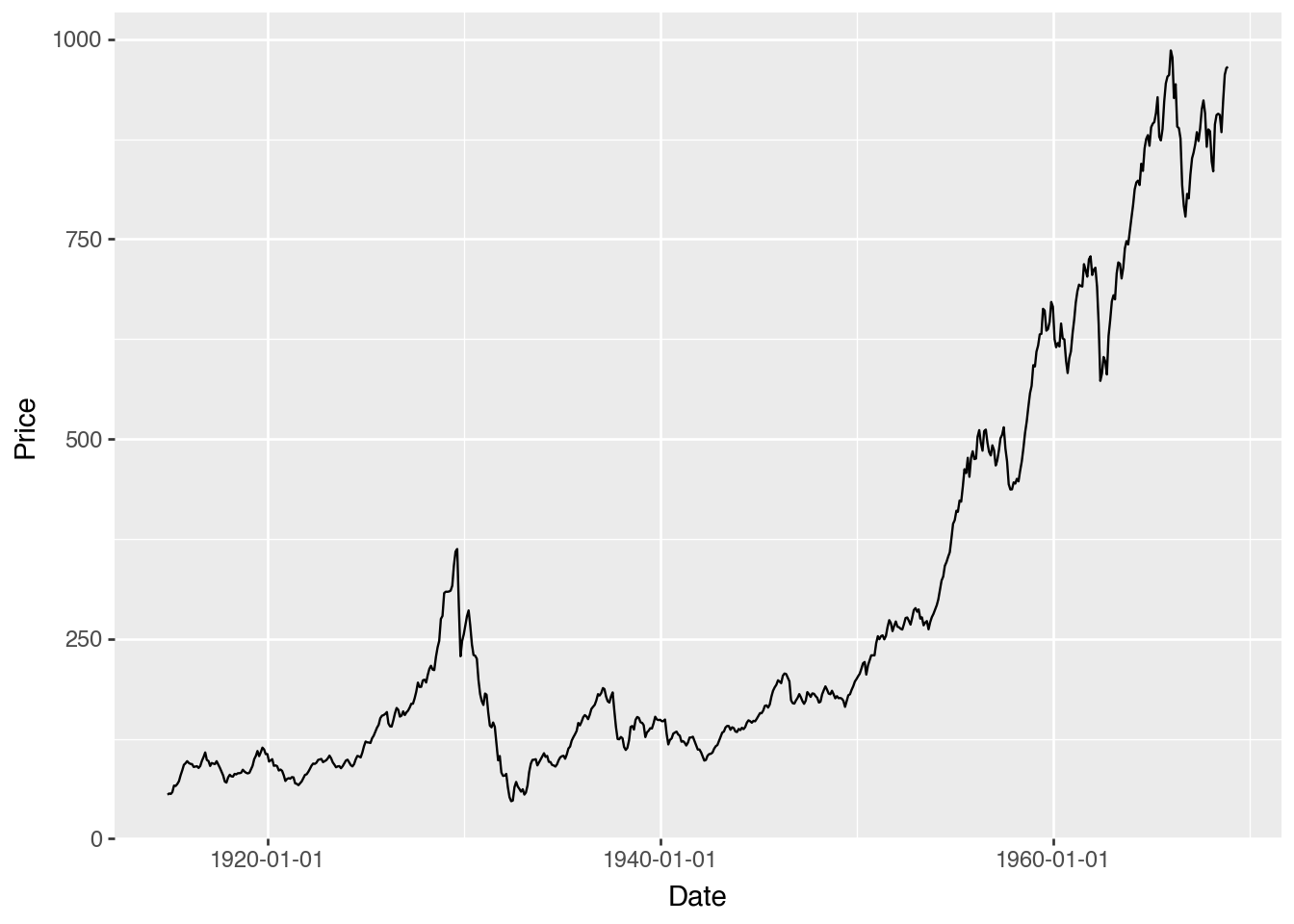
You can also add markers to the line plot to highlight the data points.
p = (
    ggplot(data=dowjones) + aes(x="Date", y="Price") + geom_line() + geom_point()
)
p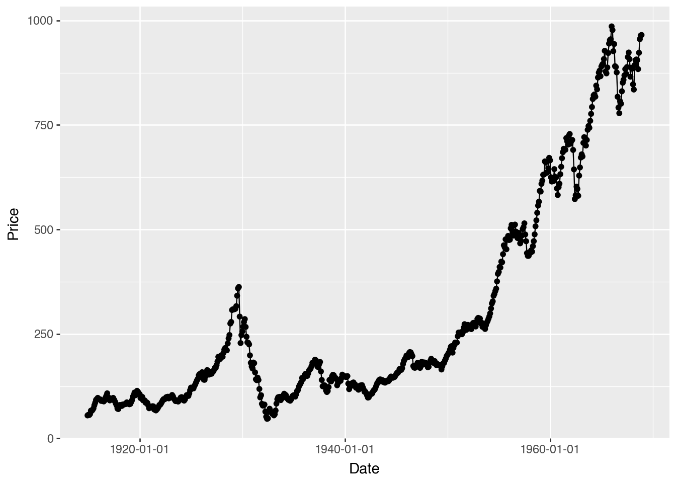
import random

# Create datasets for comparison
dowjones2 = dowjones.copy()
dowjones2['type'] = 'old'

dowjones3 = dowjones.copy()
dowjones3['Price'] = dowjones3['Price'] + random.random() * 200
dowjones3['type'] = 'new'

dowjones4 = pd.concat([dowjones2, dowjones3], ignore_index=True)
dowjones4 = dowjones4.sort_values('Date').reset_index(drop=True)dowjones4.head()| Date | Price | type | |
|---|---|---|---|
| 0 | 1914-12-01 | 55.000000 | old |
| 1 | 1914-12-01 | 57.601244 | new |
| 2 | 1915-01-01 | 59.151244 | new |
| 3 | 1915-01-01 | 56.550000 | old |
| 4 | 1915-02-01 | 56.000000 | old |
You can plot multiple lines on the same plot to compare different groups.
p = (
    ggplot(data=dowjones4) + aes(x="Date", y="Price") + geom_line(aes(color="type"))
)
p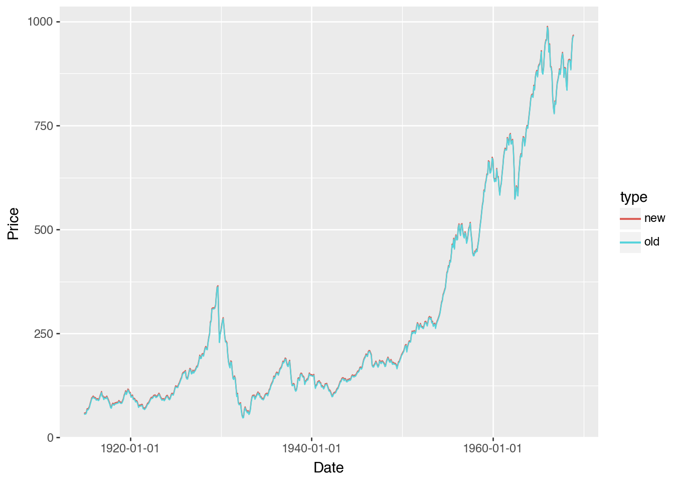
A histogram visualizes the distribution of a single continuous variable.
p = (
    ggplot(data=tips) + aes(x="tip") + geom_histogram()
)
p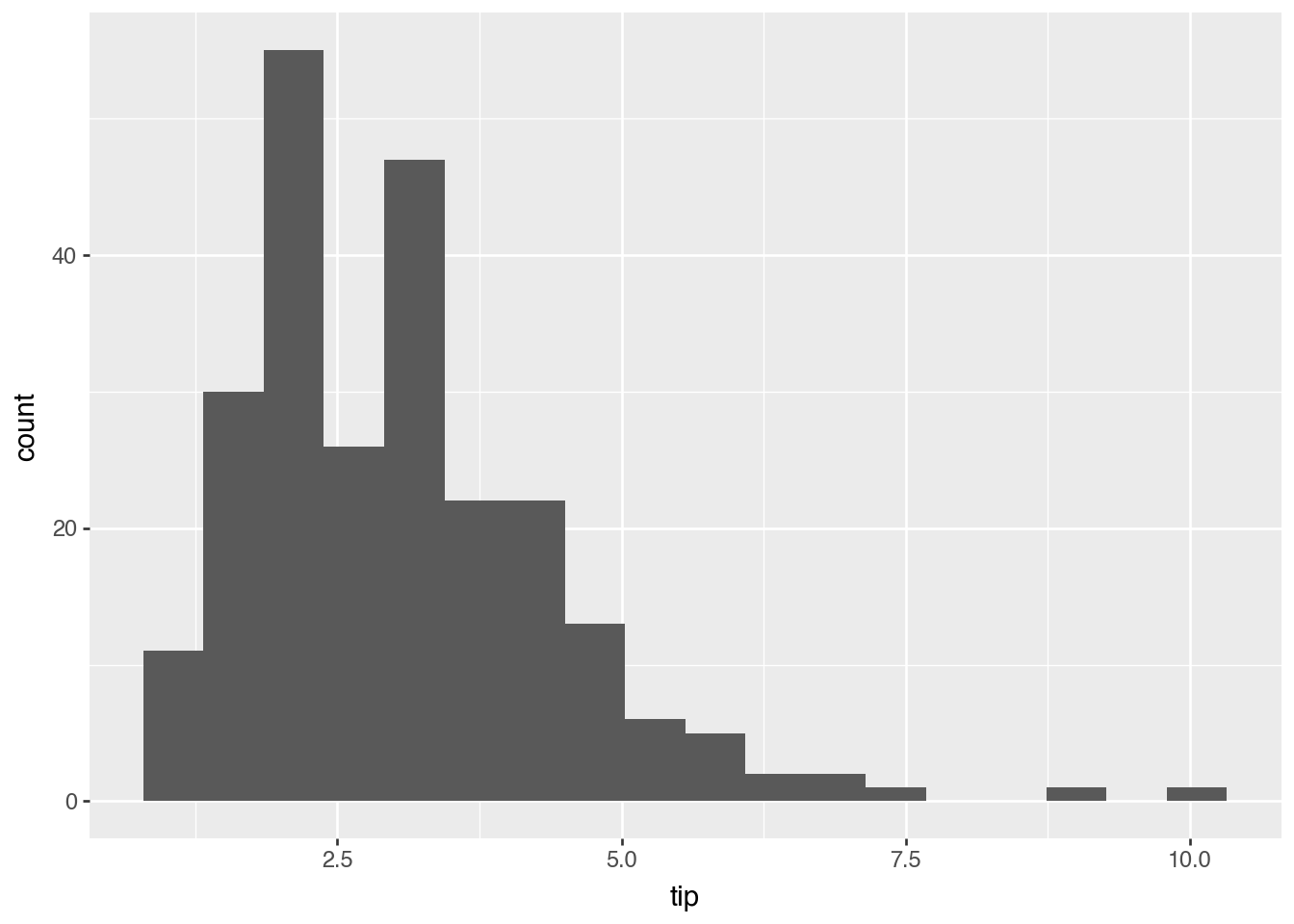
You can create separate histograms for different groups to compare their distributions.
p = (
    ggplot(data=tips) + aes(x="tip", fill='sex') + geom_histogram(position='dodge')
)
p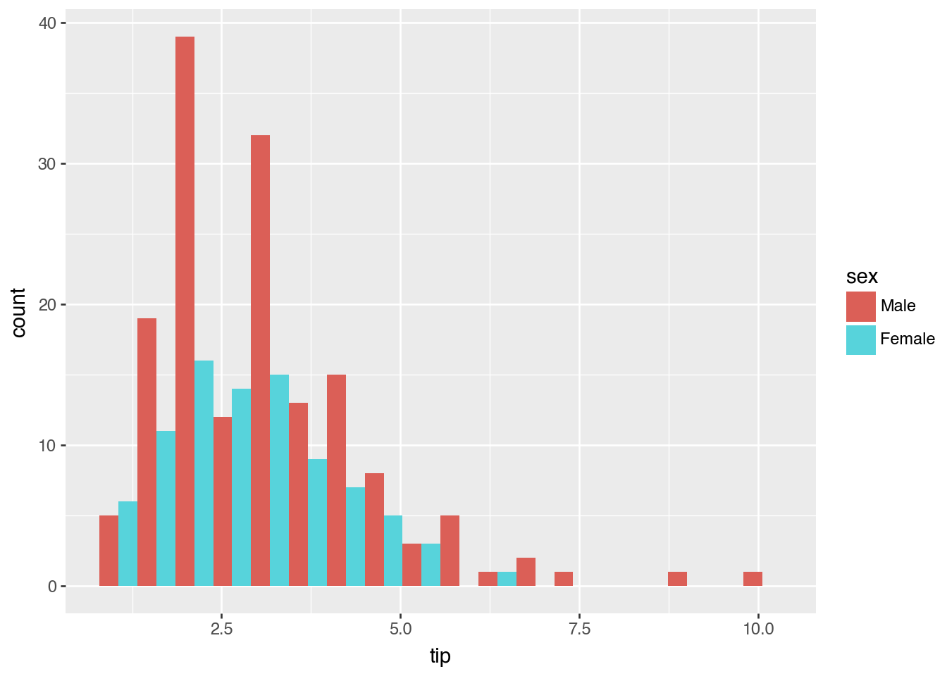
A bar chart is used to display categorical data with bars of lengths proportional to the values they represent.
p = (
    ggplot(data=tips) + aes(x='sex', y='tip', fill="sex") + geom_col()
)
p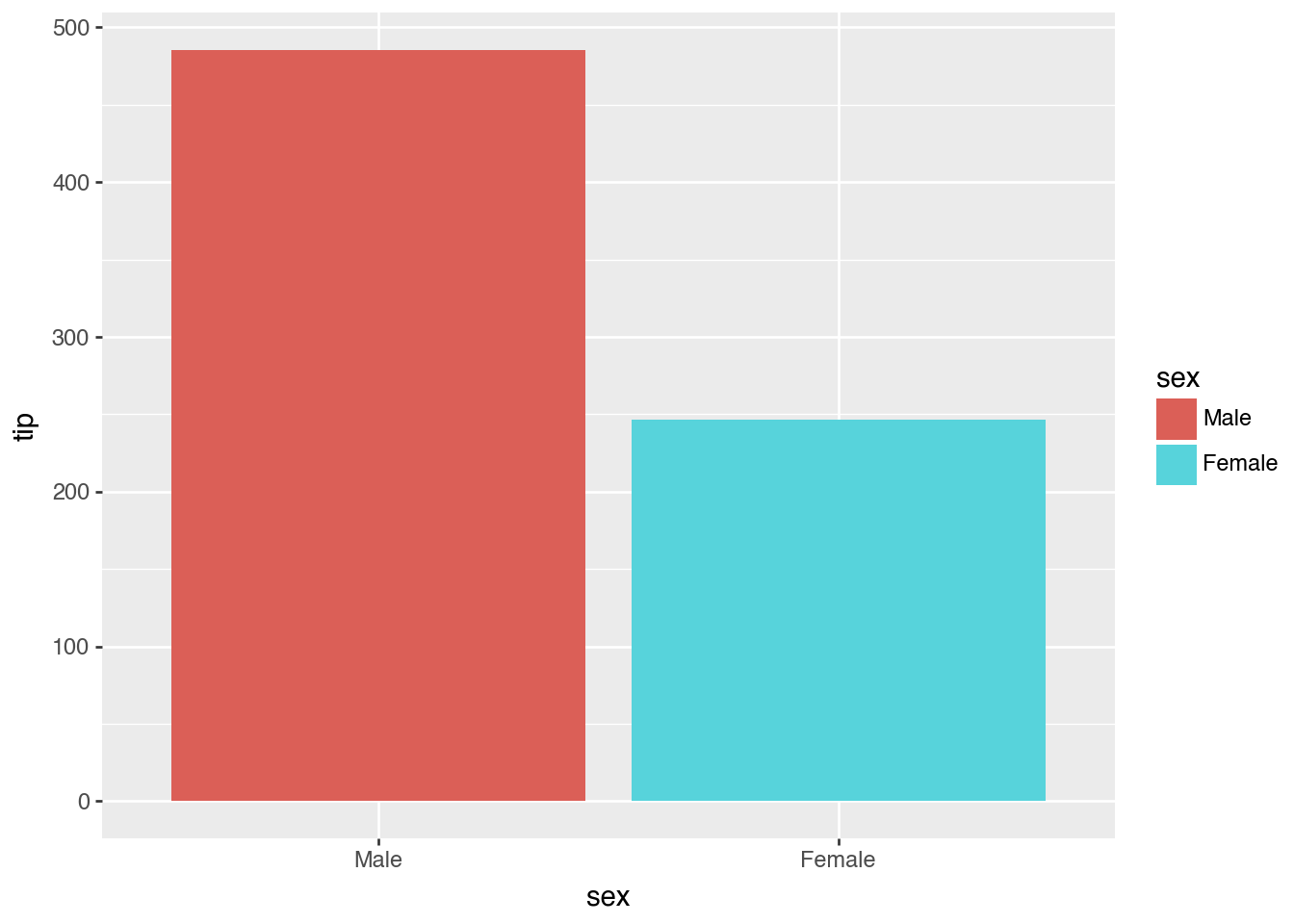
A box plot shows the distribution of a dataset, including the median, quartiles, and potential outliers.
p = (
    ggplot(data=tips) + aes(x='day', y='tip', fill="day") + geom_boxplot()
)
p
You can group box plots by a categorical variable to compare distributions.
p = (
    ggplot(data=tips) + aes(x='day', y='tip', fill="sex") + geom_boxplot()
)
p
A strip plot is a scatter plot for a categorical variable, showing the distribution of data points.
p = (
    ggplot(data=tips) + aes(x='day', y='tip') + geom_jitter(width=0.1)
)
p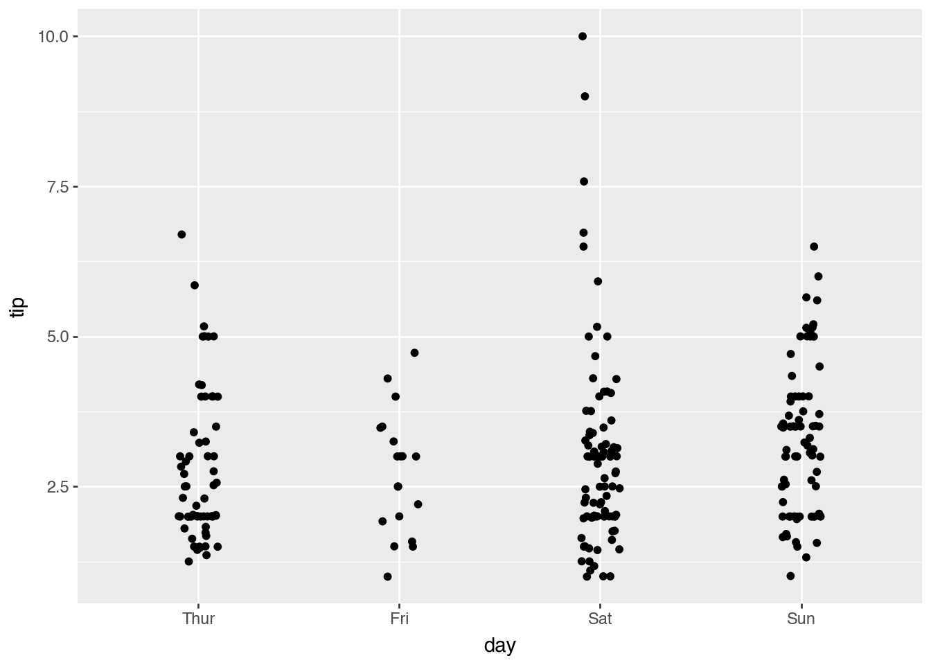
You can color the points in a strip plot to distinguish between different groups.
p = (
    ggplot(data=tips) + aes(x='day', y='tip', fill="sex") + geom_jitter(position=position_jitterdodge())
)
p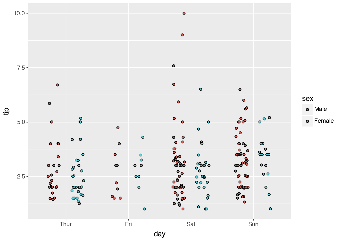
Facet plots create subplots for different subsets of the data, allowing for easy comparison.
p = (
    ggplot(data=tips) + aes(x="tip", y="total_bill") + geom_point(aes(color="sex"))
    + facet_wrap("day")
)
p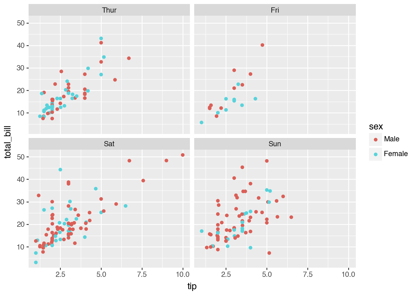
You can control the layout of the facet grid by specifying the number of columns.
p = (
    ggplot(data=tips) + aes(x="tip", y="total_bill") + geom_point(aes(color="sex"))
    + facet_wrap("day", ncol=3)
)
p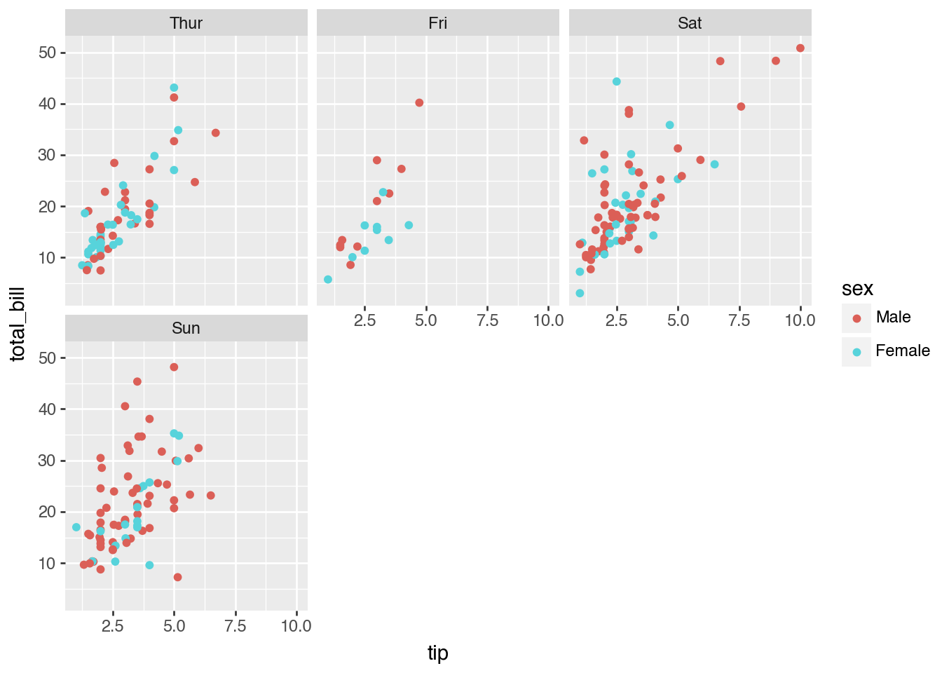
You can add a title to your plot to provide context.
p = (
    ggplot(data=tips) + aes(x="tip", fill='sex') + geom_histogram(position='dodge') + ggtitle("Tip by Sex")
)
p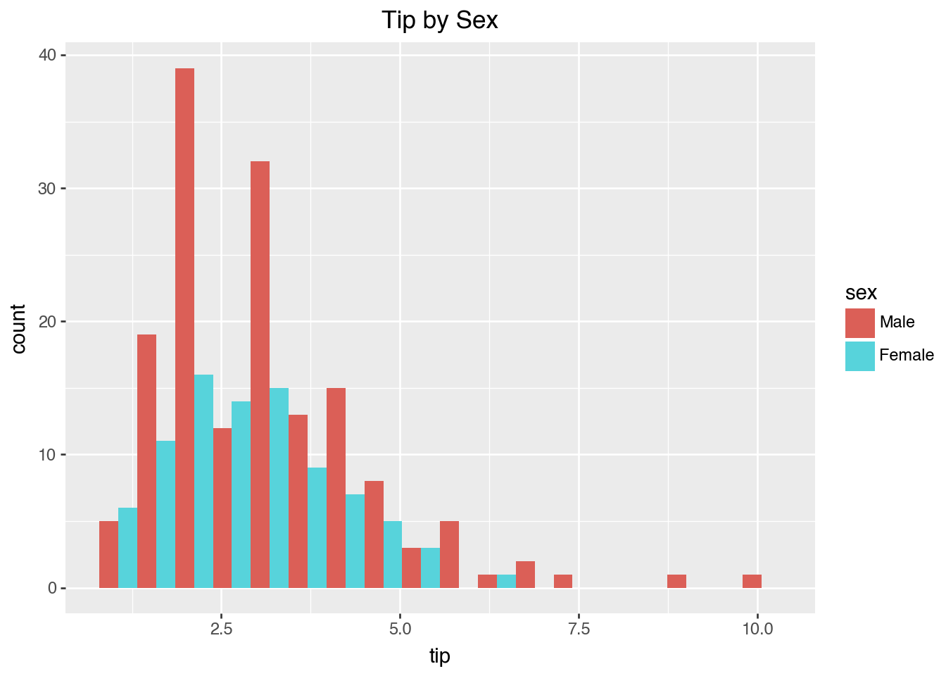
The size of the plot can be customized to fit your needs.
p = (
    ggplot(data=tips) + aes(x="tip", fill='sex') + geom_histogram(position='dodge') + ggtitle("Tip by Sex") + theme(figure_size=(4, 3))
)
p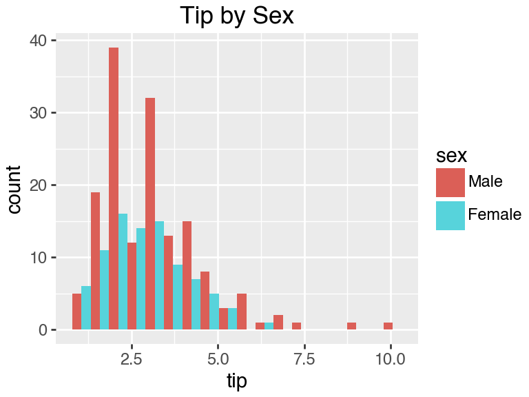
You can change the labels of the x and y axes for clarity.
p = (
    ggplot(data=tips) + aes(x="tip", y="total_bill") + geom_point() + scale_x_continuous(name="New X Name") + scale_y_continuous(name="New Y Name")
)
p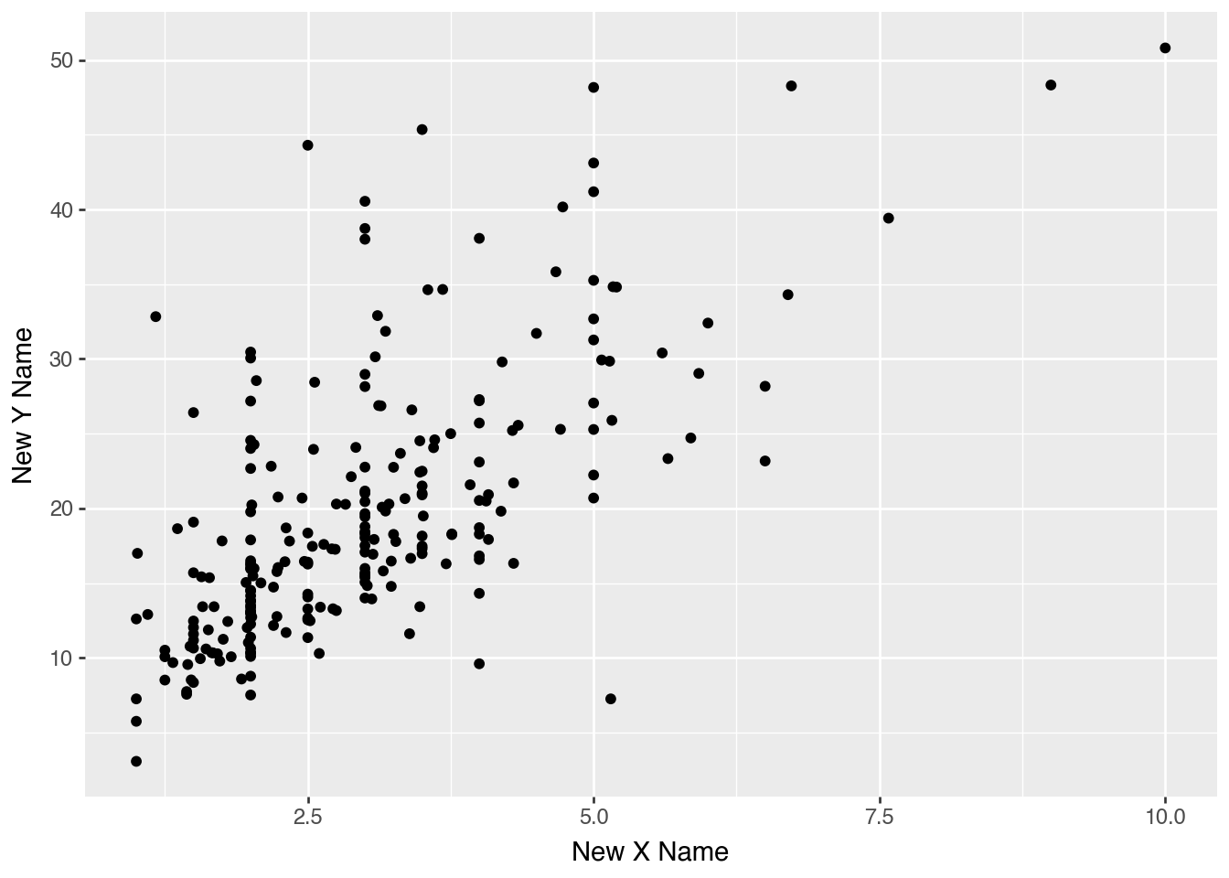
Plotnine offers several built-in themes to change the appearance of your plots. You can find all themes here.
This theme gives your plots a hand-drawn, xkcd-style look.
p = (
    ggplot(data=tips) + aes(x="tip", fill='sex') + geom_histogram(position='dodge') + theme_xkcd()
)
p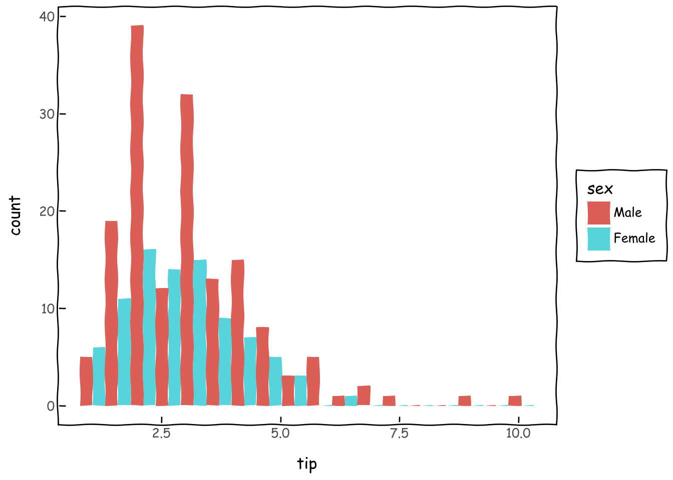
This theme mimics the style of the FiveThirtyEight website.
p = (
    ggplot(data=tips) + aes(x="tip", fill='sex') + geom_histogram(position='dodge') + theme_538()
)
p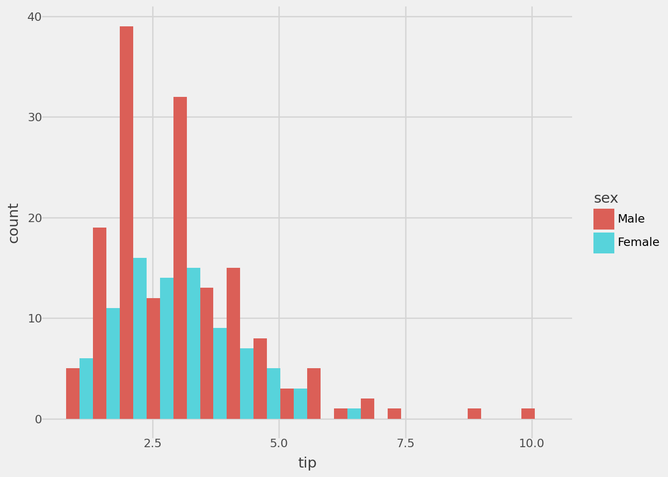
This theme uses a dark background for a modern look.
p = (
    ggplot(data=tips) + aes(x="tip", fill='sex') + geom_histogram(position='dodge') + theme_dark()
)
p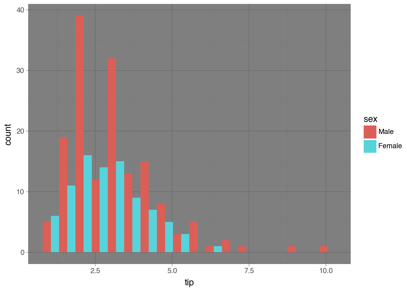
You can save your plot to a file in various formats.
p = (
    ggplot(data=tips) + aes(x="tip", fill='sex') + geom_histogram(position='dodge') + theme_dark()
)
p.save(filename='test3.png')Plotnine can also be used to create animated plots.
from plotnine.animation import PlotnineAnimationnew_data = dowjones4.sample(50, random_state=42)
new_data = new_data.sort_values(by=['Date'], ascending=True)
def plot(x):
df2 = dowjones4.query('Date <= @x')
p = (
ggplot(df2, aes(x='Date', y='Price'))
+ geom_line(aes(color="type"))
+ theme(subplots_adjust={'right': 0.85})
)
return p
plots = (plot(i) for i in new_data["Date"])from matplotlib import rc
rc("animation", html="html5")
animation = PlotnineAnimation(plots, interval=300, repeat_delay=500)
animation